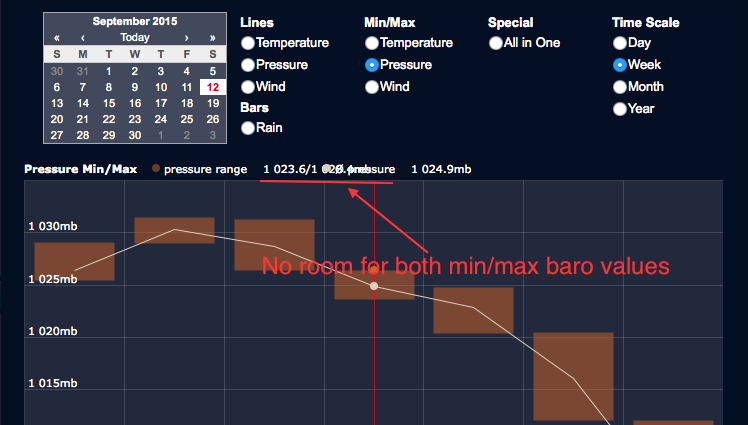
I noticed that when using the javascript engine to render the "dashboard" graphs (whereby you can choose the date/graph-type, etc), there seems to be insufficient room to correctly display the values for the Min/Max Barometer / Windspeeds just above the graph itself.
Although I have modified the original graphs, this exact same problem exists in the original dashboard version also. The problem is only evident when using javascript. The flash version looks fine, but I am deliberately avoiding flash now that most of my visitors are using iPads/mobile devices to access the site (and I do not want users to have to support flash).
I have attached a sample of the issue below, showing where the min/max barometer values are hidden behind the next average-pressure field:
Any thoughts on how I can solve this issue would be most appreciated.
Not enough room for dashboard min/max values - javascript
- Attachments
-
- Screen Shot 2015-09-12 at 21.45.30.png (69.45 KiB) Viewed 15148 times
Re: Not enough room for dashboard min/max values - javascript
Just give it a shorter name like "press" or "baro" instead of "pressure range".
Re: Not enough room for dashboard min/max values - javascript
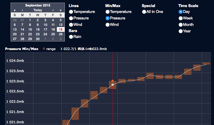
Thanks for the reply Boris. I tried your suggestion (I had tried this previously too) and unfortunately it simply shifts everything over to the left with no extra room between fields. The problem seems to be the space between the two fields, rather than the length of the label. Here's a screenshot with the abbreviated names showing the problem still exists:
- Attachments
-
- Screen Shot 2015-09-19 at 21.35.46.png (61.89 KiB) Viewed 15127 times
Re: Not enough room for dashboard min/max values - javascript
I can confirm this problem when using the Javascript Engine. Shorter names do not help. There's a bug with calculating the space required for min/max values.