Although I have modified the original graphs, this exact same problem exists in the original dashboard version also. The problem is only evident when using javascript. The flash version looks fine, but I am deliberately avoiding flash now that most of my visitors are using iPads/mobile devices to access the site (and I do not want users to have to support flash).
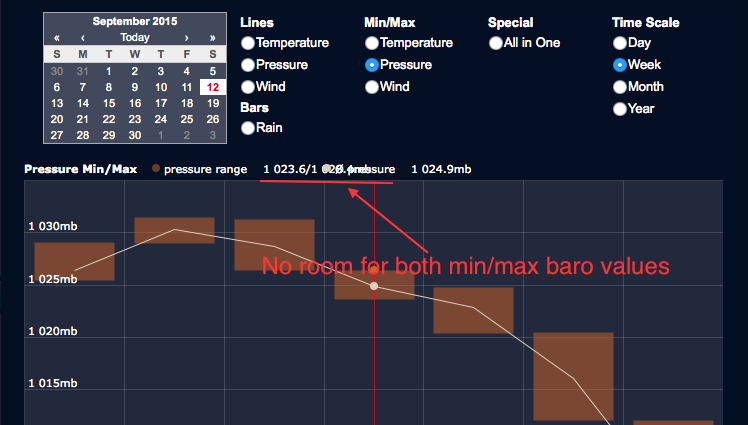
I have attached a sample of the issue below, showing where the min/max barometer values are hidden behind the next average-pressure field:
Any thoughts on how I can solve this issue would be most appreciated.


